Reddit users rethink gray after new approach
Reddit’s home decor forums have turned against gray interiors. In threads about trends that won’t age well, the most upvoted comment is almost always some version of “gray everything.” One user pleaded with house flippers to stop using gray walls and laminate flooring.
A review of 3,958 comments across 45 interior design discussions found that complaints about gray outnumbered gripes about any other feature. The sentiment is nearly universal.
For many, gray has become shorthand for bland, builder-grade spaces. It’s the default choice in rental units and flipped homes, often paired with flat white trim and cheap finishes. That association has made the color feel tired, even if the issue isn’t the hue itself but how it’s applied.
Some designers still defend it. Arvin Olano painted his office a moody slate despite pushback from followers. The result, he says, feels fresh and modern. Lauren Caron, founder of Studio Laloc, took it further in a Mercer Island, Washington, home, covering nearly every room in shades of gray. The space doesn’t read as cold or sterile—it feels warm, traditional, and deliberate.
They argue the difference lies in execution. The problem isn’t gray; it’s the lack of contrast, texture, and personality that usually accompanies it.
Caron’s Mercer Island project shows the color can anchor a room without dominating it. In one space, light gray walls serve as a backdrop for neoclassical furniture—a Bardiglio marble table, a Savonarola chair, and a French Provincial dresser. The antiques prevent the palette from feeling dated.
The stairwell features Antoinette Poisson’s Grenades wallpaper, a floral stripe that adds character. Following design influencer Robert Gigs’s lead, Caron layered Farrow & Ball’s French Gray with deep reds, chestnut browns, and lavender in another project. The mix avoids a flat appearance.
Related: Sharp cuts start with the right knife
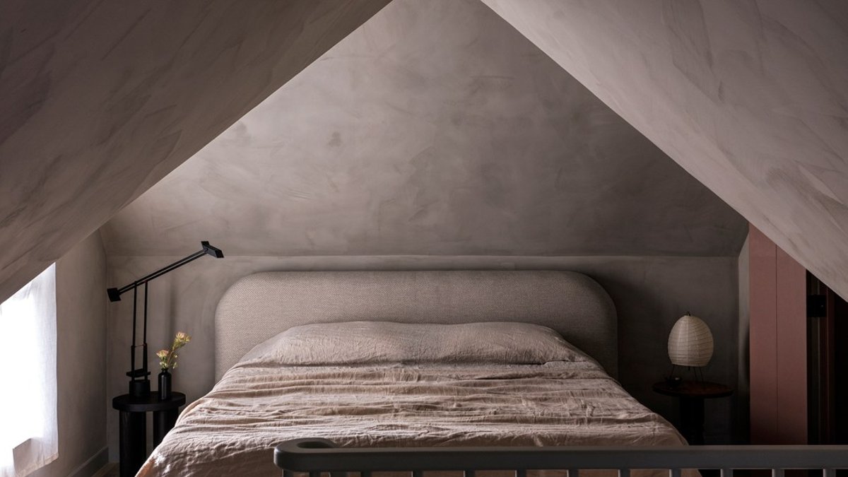
Architect Kitty Lee applied the same principle in an A-frame bedroom. Gray walls, trim, and ceiling create a cocooning effect, but the dramatic angles and textured finishes keep it from feeling like a box.
Finish also plays a role. Post Company used Portola’s Dry Ground limewash in a New York bedroom, a greige with enough texture to avoid the sterile look of standard paint. The outcome is balanced, not dull.
The gray backlash isn’t really about the color. It reflects how trends get diluted when they enter the mainstream. What begins as a bold choice—like moody, saturated grays in high-end design—becomes a safe, mass-market default. By the time it appears in rental listings and flipped homes, it’s stripped of its original intent.
This pattern isn’t unique to gray. Open kitchens, barn doors, and shiplap spread quickly among early adopters, then became developer staples before falling out of favor. Gray stood out because of how fast it became everywhere. It wasn’t just a trend—it dominated for nearly a decade.
The designers resisting the backlash aren’t calling for a return to all-gray spaces. They argue the color still has potential when used carefully. The real issue was the lack of creativity.
Caron’s Mercer Island home might not sway Reddit’s opinion. But it demonstrates that gray isn’t the problem—uninspired design is.

Former Pool House Transforms into Home's Favorite Room


