Bold colors redefine spaces with thoughtful pairings
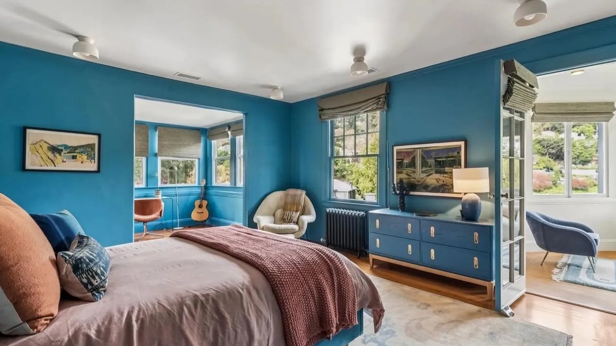
A room’s character begins with its color scheme. Neutral tones maintain their enduring appeal, but bold pairings can transform the atmosphere, introducing warmth, vitality, or sophistication without overwhelming. The secret lies in harmony: selecting shades that complement each other while allowing one to dominate. These five curated combinations provide proven methods to infuse personality into any space, from living areas to kitchens.
Rich Depth: Burgundy and Olive
Burgundy and olive green together create an earthy, luxurious ambiance ideal for social spaces. Both share an organic foundation, preventing visual conflict while adding depth. Burgundy contributes richness, while olive grounds the effect. This pairing excels in dining rooms or living areas, where deeper tones enhance intimacy.
Olive walls paired with burgundy upholstered furniture—such as a velvet sofa or armchairs—establish visual cohesion. Velvet cushions, curtains, or accent chairs introduce contrast without full commitment. Warm wood accents, aged brass fixtures, and soft lighting soften the combination. A touch of cream on trim or textiles prevents the palette from feeling heavy.
Natural materials like linen or rattan reinforce the connection between the colors, ensuring the space feels intentional rather than chaotic. The outcome is a room that balances refinement with lived-in comfort.
Playful Contrast: Lime and Green
For a brighter, more dynamic approach, lime and green offer a revitalized take on nature-inspired design. Lime’s brightness energizes a room, while deeper greens, such as forest or moss, provide balance, preventing visual strain. This combination works particularly well in kitchens, bathrooms, or creative workspaces where color can stimulate creativity.
Lime can appear in cabinetry, backsplashes, or statement lighting, while green dominates walls or larger furniture pieces. If full walls feel risky, smaller applications, like artwork, ceramics, or throw pillows, achieve the same effect. Pairing these shades with stone countertops, timber flooring, or linen textiles maintains a cohesive, modern aesthetic.
Read Also: Winemakers debut Last Light cocktail at Groot Phesantekraal
This pairing thrives in spaces with abundant natural light, where the colors shift subtly throughout the day. For lower-light rooms, slightly muted lime, a pale chartreuse, avoids overwhelming the space.
Unexpected Harmony: Purple and Yellow
Purple and yellow, positioned opposite each other on the color wheel, create a striking yet balanced effect. The key is moderation: a muted lilac with mustard yellow produces a soft, inviting atmosphere, while deeper plum paired with golden yellow delivers bold drama. This combination suits living rooms, bedrooms, or home offices where personality matters.
Introduce the colors through artwork, upholstered chairs, or patterned rugs rather than entire walls. A neutral foundation, warm white, beige, or natural wood, allows the colors to stand out without dominating. Metallic accents, brass or gold, add a touch of luxury.
Timeless Elegance: White and Red
White and red provide versatility, adapting to everything from minimalist kitchens to vintage-style living rooms. White serves as a clean canvas, while red introduces warmth and depth. In kitchens, red cabinetry or bar stools contrast sharply against white walls and countertops. Living areas benefit from a red accent chair, bold artwork, or patterned cushions.
Dramatic Contrast: Black and Orange
Black and orange deliver a modern, high-impact pairing that feels both structured and inviting. Black provides definition, while orange softens the contrast with warmth.
Black feature walls paired with burnt-orange seating create a striking focal point. Alternatively, orange cushions, rugs, or artwork against darker furniture introduce the contrast subtly. For a softer approach, charcoal replaces black, and rust or amber tones replace bright orange.


